Closed Positions
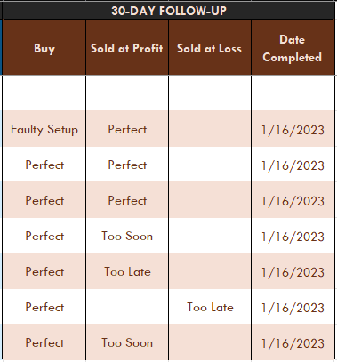
Added a 30-Day Follow -Up matrix to the Closed Positions tab. This way I can keep track of my buy and sell points and use the following charts to see where I need to improve and where I’m doing it right. I may add more data points later, but this is the data Mark Minervini tracked so it’s a good starting point.
Follow-Ups
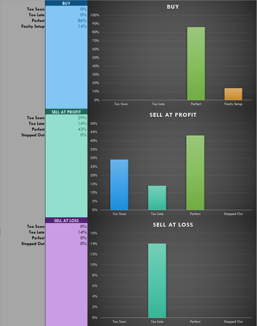
These are the charts that correspond to the 30-Day Follow-Up mentioned above. Over time I can visualize where I need to improve and what I’m doing well.
The Curve
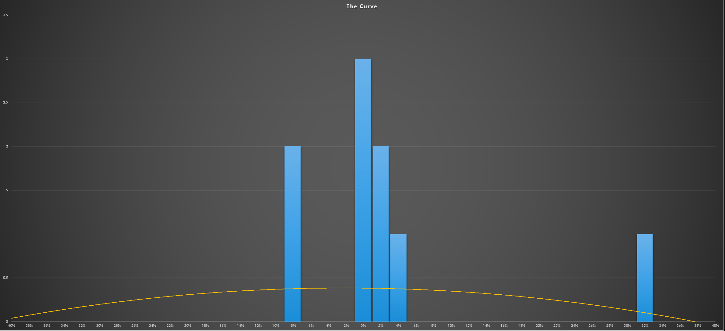
This is a profit/loss distribution curve. Again, this was modeled after Mark Minervini. The idea is to visualize your p/l distribution curve, so that in time, the taller bars will be further to the right and small bars to the left. The more data you can aggregate to the right, the better you are doing.